Color, typography and motion: audiovisual design principles
Audiovisual design is graphic design + time
A static poster is finished in one moment.
A video is 24 posters per second.
So graphic design rules apply, but with an extra dimension: movement through time.
Colors in video (different from print)
In print: colors are static. They stay.
In video: colors move, change, disappear.
Rule 1: Limit the palette 3-4 main colors. Everything else is highlight and draws the eye.
Rule 2: Consider the background A color beautiful on white might disappear on black.
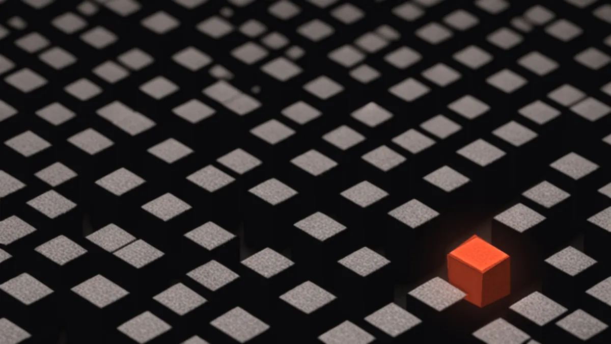
Rule 3: Use color to guide attention When focus shifts, color shifts too. Connects visually.
Rule 4: Test on multiple screens Colors look different on MacBook vs. TV. Test everywhere.
Typography in motion (not static typography with effects)
Video typography must be:
Legible in small screens If invisible on phone, it failed.
Respect hierarchy Title large, body medium, detail small. Never varies.
Have space Tight typography in video looks chaotic.
Serve the emotion Letter flipping is tiresome. Smooth entry is professional.
Movement in design
Purpose: Every animation should communicate something.
Timing: What lasts 1 second vs. 2 seconds changes meaning.
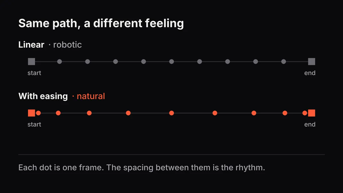
Easing: Linear movement looks robotic. Eased movement feels natural.
Sequence: What moves first? What impact does that have on reading?
The rule of 3 simultaneous elements
Don’t animate 5 things at once. Your eye can’t follow.
Sequence: 1st moves → 2nd moves → 3rd moves. Clean. Clear.
Proportion: what’s big vs. small
Size communicates importance.
Big = important. Small = support.
If you want the call to action to be the focus, it has to be the biggest thing on screen.
Application examples
Education: A key phrase changes color, then the supporting details appear one by one.
Sales: The product is big and colorful. Benefits appear small around it. CTA in a contrasting color.
Brand: The logo evolves through colors and shapes. It tells a story visually.
What to avoid
- Type too small for video
- Colors that vibrate against each other (a headache for the viewer)
- Motion that competes with information (motion distracts)
- A color palette that changes every second
Good audiovisual design is invisible to the viewer. They follow the narrative naturally.
Which design element do you find most challenging in video?