← Back to portfolio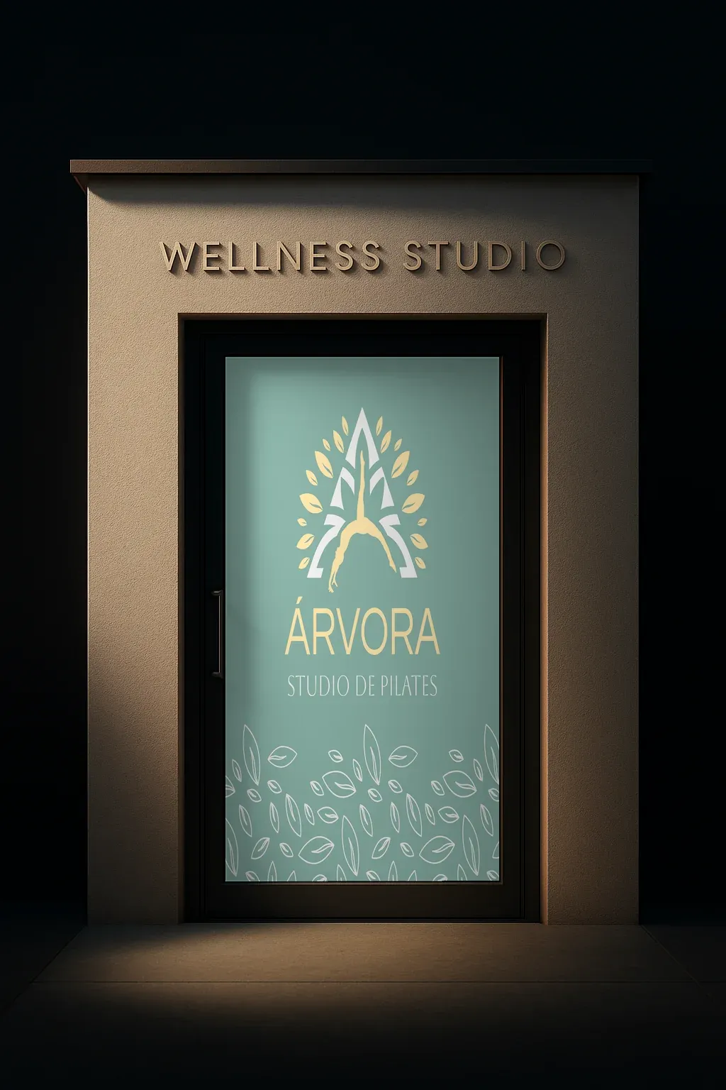
Graphic Design
Árvora Studio de Pilates — Visual Identity
Árvora Studio de Pilates
Context
Árvora needed a brand that read Pilates as a wellness practice, not generic fitness — an identity with the physical presence of a neighborhood studio and, at the same time, the delicacy of a boutique spa.
Process
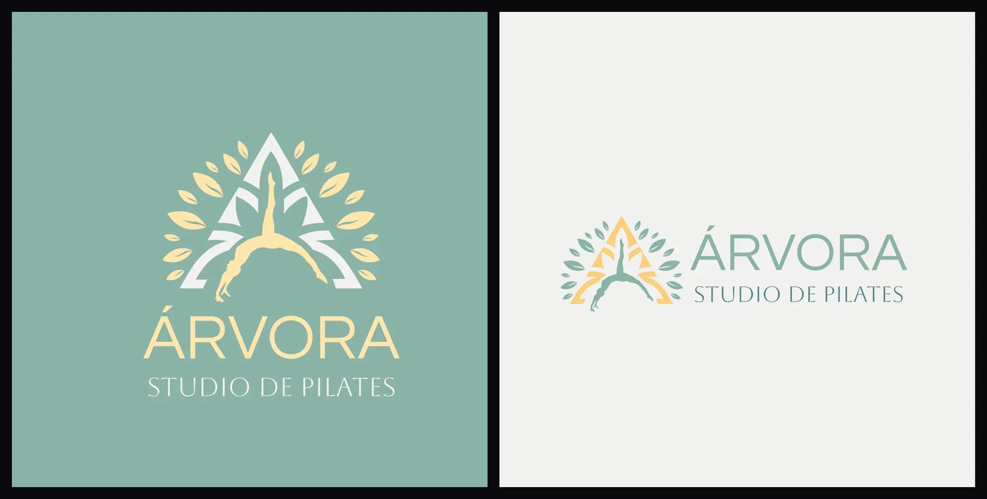
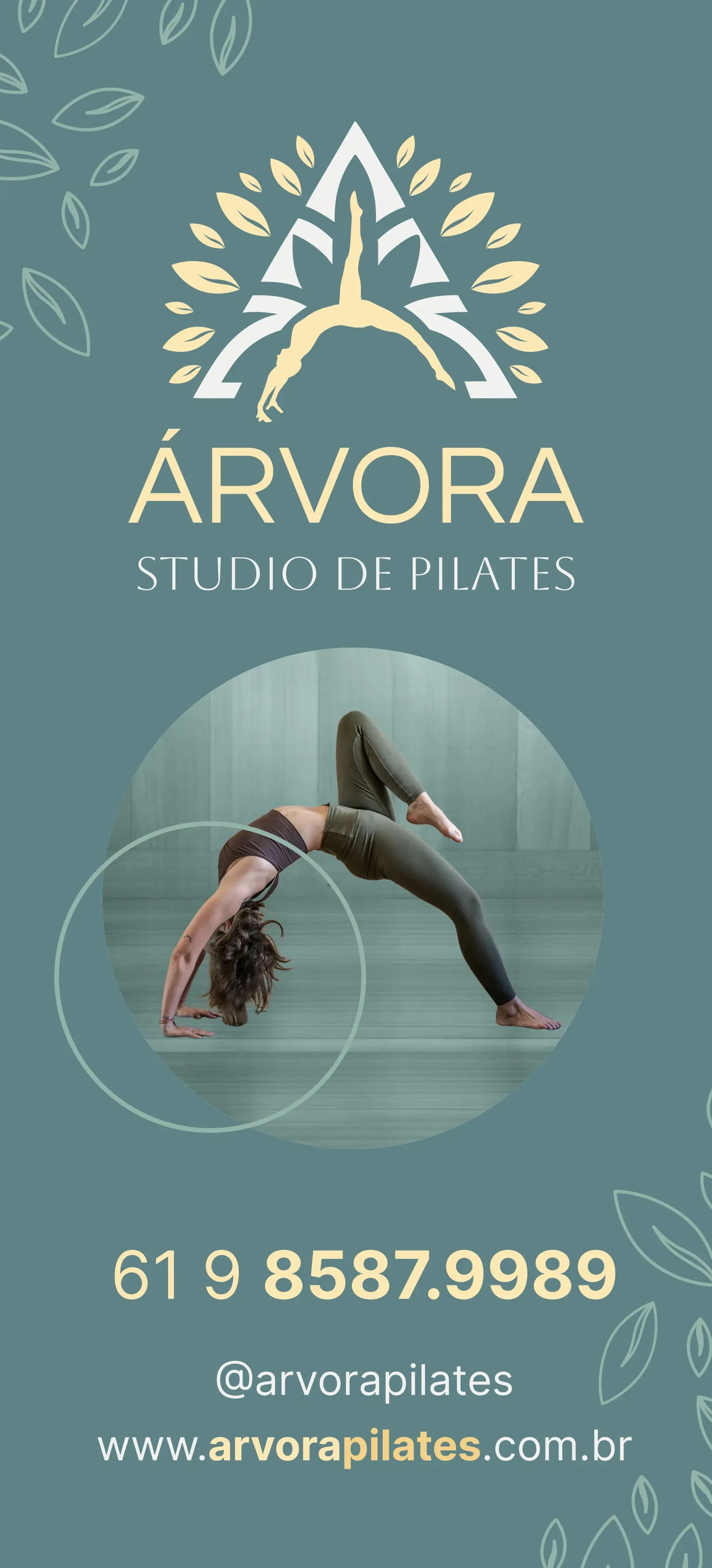
- Symbol — a body in a backbend, a classic Pilates pose, that is at once the negative space of a capital “A” and the trunk of a tree. A halo of leaves in gold and green radiates from the top: body and nature in a single form.
- Palette — two interchangeable colorways, sage and cream, always with gold as the accent of light.
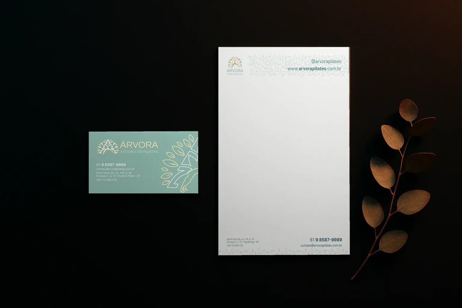
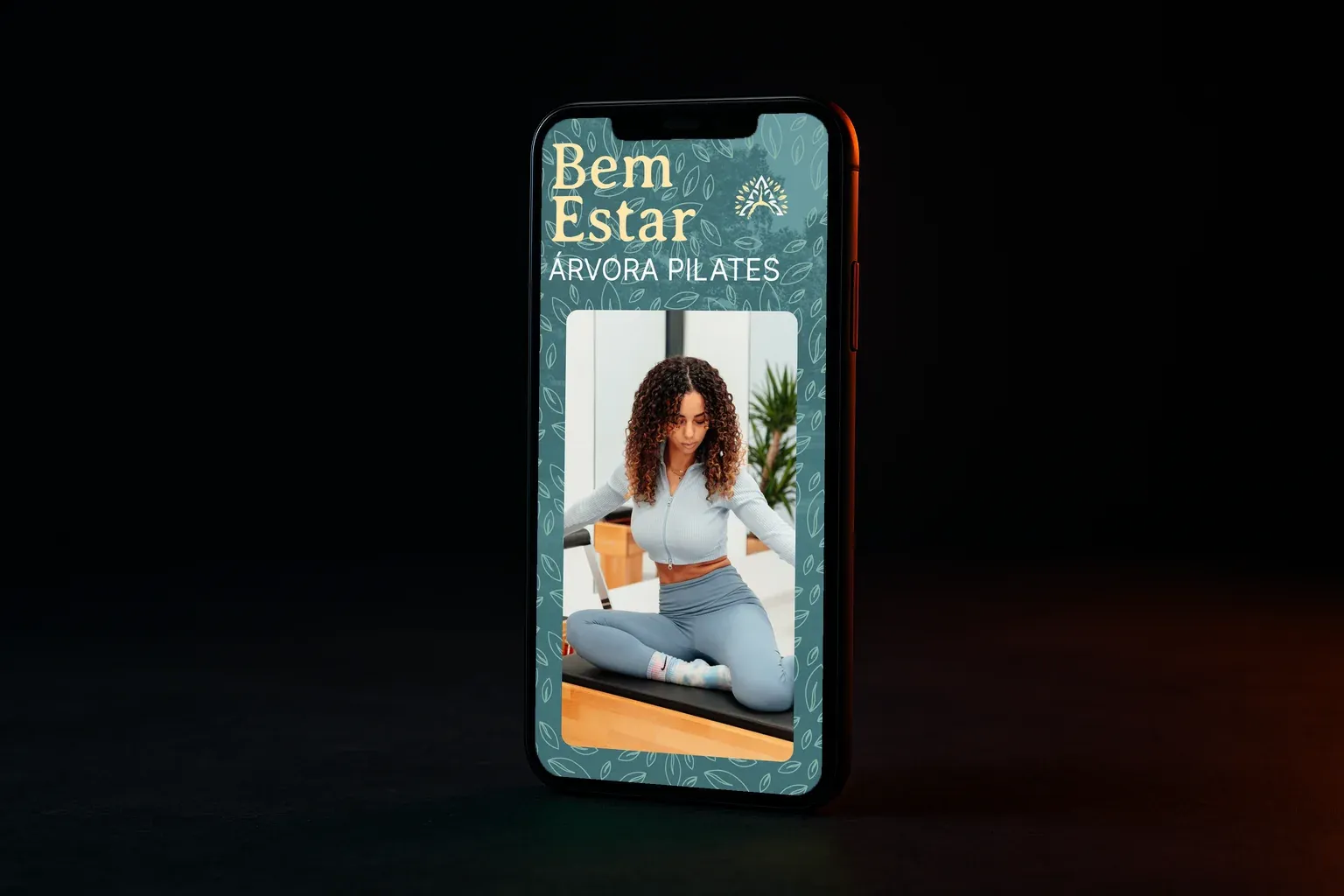
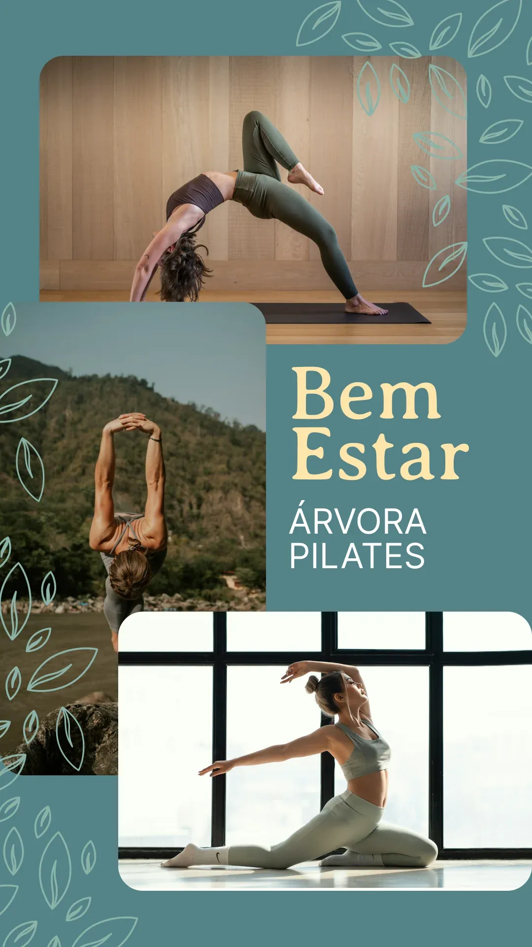
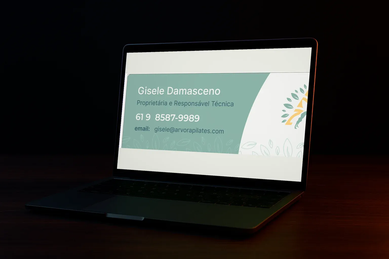
- System — a fine-line leaf texture becomes a recurring backdrop, and the symbol itself, bleeding off the edge on the diagonal, signs the business card, stationery and storefront alike.
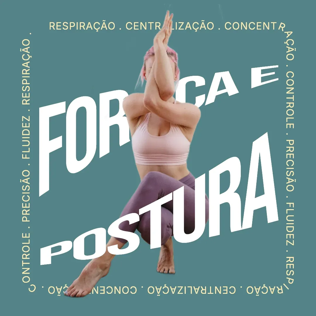
- Applications — from the business card and email signature to the glass decal on the studio’s storefront, through social media and the practice’s own photography.
Result
A complete identity that moves from business card to the glass storefront of the physical studio, guided by one line that sets the tone for everything: “Move with purpose, live with quality. That’s the Árvora way.”